Dogs Trust
How we helped the UK’s leading dog charity reclaim its bark in a crowded charity world
Dogs Trust
How we helped the UK’s leading dog charity reclaim its bark in a crowded charity world

Dogs Trust, the UK’s leading dog charity, needed a bolder, more visible brand to grow their supporter base and compete in an increasingly crowded fundraising landscape. Working with us at The Clearing since their rebrand from NCDL nearly 20 years ago, the result is a radically evolved visual and verbal identity which is more expressive, more dynamic, and built to work harder across digital and social. The refreshed brand gives the charity a clearer strategic direction, a richer design system and the confidence to reach more dogs and the people who love them.
Dogs Trust is one of the best known and largest charities in the UK, but right now challenges for dogs and their owners are increasing. To tackle the problem, they need to be able to help the 257k owners each year who need support, so more dogs than ever get to live the life they deserve. So, whether it’s caring for them, lending their owners a helping hand or finding them loving families, they’re there for more dogs whenever and wherever they’re needed most.
They’re also involved in global dog welfare with a rabies vaccination programme that aims to reduce deaths from rabies by 50%, preventing 25K people dying from rabies annually and the unnecessary culling of thousands of dogs.
These are big ambitions that need investment, but fundraising today is more challenging and competitive, and the cost of delivering their services has risen. Dogs Trust needs to become bigger, bolder and more visible, with a brand better equipped to grow their reach and influence with new audiences, working harder across their digital and social platforms.
Our brief was to reaffirm their position as the dog charity and bring clarity and confidence to the brand. A revised mission, vision and story captured their bigger, bolder ambition but kept them routed in the positivity and love of dog that’s made them famous.
The new positioning makes the connection between dogs, people’s love for them and their mutual impact on each other’s lives – summarised as ‘For dogs, for love, for life’. It provides clarity and direction for everyone across the charity as well as for advertising and all other comms, connecting the strategy back to their famous strapline’ A dog is for life’.
The visual identity system has been radically evolved to be more expressive and dynamic, introducing a comprehensive motion system to further bring to life their social feeds and digital channels. The logo was subtly refined to put equal emphasis on both the words of their name. An outline has been added around their ‘dog tag’ logo to make sure it stands out more confidently. Homer, the logo’s dog has become a brand mascot and a more lively and integrated character for the brand – beautifully realised by Mr Griff the illustrator who also added more characterful dogs and people to the family of illustrations he created previously.
A broader illustration style for training and education materials has been created by Cathy Hogan, featuring more people, dogs and training-led scenarios to support the renewed focus on their rehoming and prevention work.
Sunshine yellow is still the leading colour of the brand, but new colours inspired by the world of dogs – red setter, biscuit and blonde – have been introduced to add depth and warmth. Type retains their custom font Fido, by Luzi Type, which is used boldly and expressively where it’s appropriate. Photography focuses on a ‘dog’s eye view’ capturing the bond between dogs and the people who love them as well as the dog portraits that get so many likes on their social feeds.
Their tone of voice – always one of their biggest differentiators – is positive, playful and always empathetic, capturing their personality and helping them bark louder.
A clear mission, vision and narrative that confidently captures their role and bold ambition to be all things dog for everybody who owns or loves them.
A bold, energetic and dynamically recharged identity that brings more motion, fun and ‘doggy-ness’ to the brand with bold illustrations, imagery and evolved identity elements.
“Whether through rehoming or prevention or our wider international work, our mission is to improve the lives of dogs everywhere. Working with The Clearing to refresh the brand gave us the tools to tell that story more clearly and more powerfully. Dogs Trust now has a warmer, more emotional identity that reflects the joy, playfulness and personality of the world of dogs.” Jayne Whitton, Chief Marketing and Communications Officer at Dogs Trust
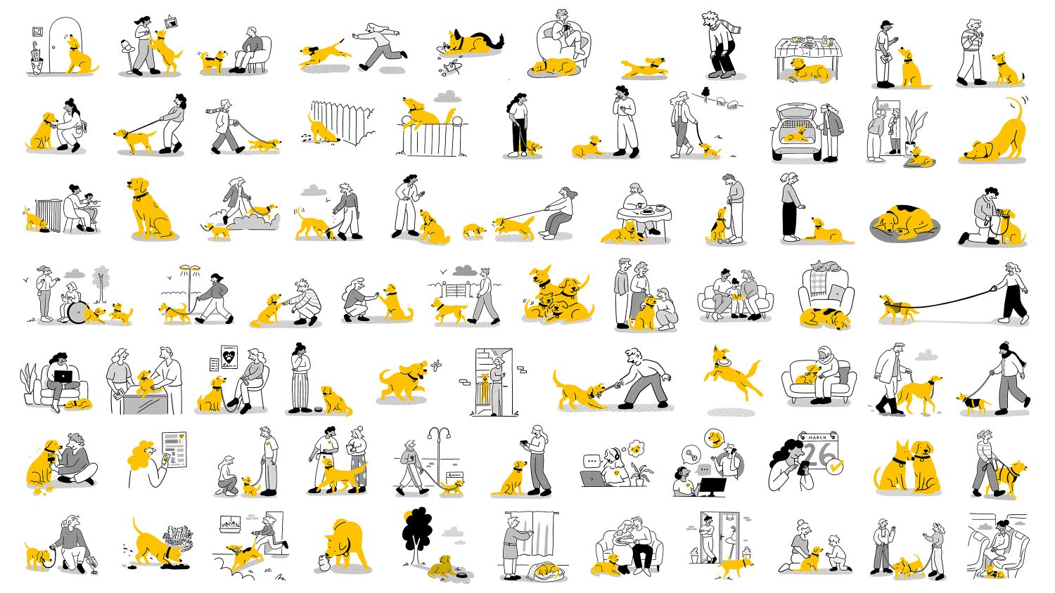
Illustration – Mr Griff
Illustration – Cathy Hogan
Motion – Ignatz Johnson Higham
Motion – Andy Tomlinson
Film production – Fight Gravity
Web design – Aer Studios
Typography – Luzi Type
Dogs Trust refreshed its brand to stand out in a highly competitive fundraising landscape and to better meet the rising challenges facing owners and dogs across the UK. To support the 257,000 owners who need help each year and fund global initiatives like their rabies vaccination programme, the charity needed a bigger, bolder presence. The brand was evolved to cut through a crowded charity world and to work much harder across modern digital and social platforms.
The strategy brings clarity and confidence to the charity’s big ambitions while keeping it firmly rooted in a mutual love for dogs. Summarised by the strategic phrase “For dogs, for love, for life,” the new positioning provides clear direction for advertising and internal teams, connecting the charity’s modern goals directly back to its world-famous public strapline, “A dog is for life.”
The visual language was dynamically updated to bring more motion and “doggy-ness” to the brand while keeping iconic elements like their signature sunshine yellow colour and custom Fido typography. The logo was subtly refined with a new outline around the dog tag to help it stand out online, while Homer, the logo’s dog, was transformed into an active brand mascot alongside a warm new colour palette and a playful family of illustrations.
A major focus of the evolution was creating a comprehensive motion and animation system designed specifically to bring social media feeds and digital touchpoints to life. The result is a dynamically recharged identity that gives Dogs Trust a warmer, more emotional, and highly visible way to tell its story powerfully, giving the charity the tools and confidence to reach more dogs and the people who love them.