Larah
Standing out in a crowd, and in Indian homes
Larah
Standing out in a crowd, and in Indian homes

Larah had grown into one of India’s best-selling opalware brands. But, despite high-quality, beautifully designed products, Larah was confused with its more famous parent brand, Borosil, as well as other Indian opalware brands, as all traded on the same traditional ideas of quality. It needed to compete in the crowded marketplace and opalware sector, and aimed to tap into the everyday serveware market, traditionally dominated by steel products.
It was a multifaceted challenge, but the team came to us with a singular brief: to create a brand that transformed Larah into a household favourite.
We defined what it means to be a modern Indian homemaker with the brand promise: Express your real self. The entire Larah brand was designed to embody this sentiment while providing a platform for customer self-expression. We developed three brand values: Savvy, Proud, and Transformative, to articulate what Larah means to customers.
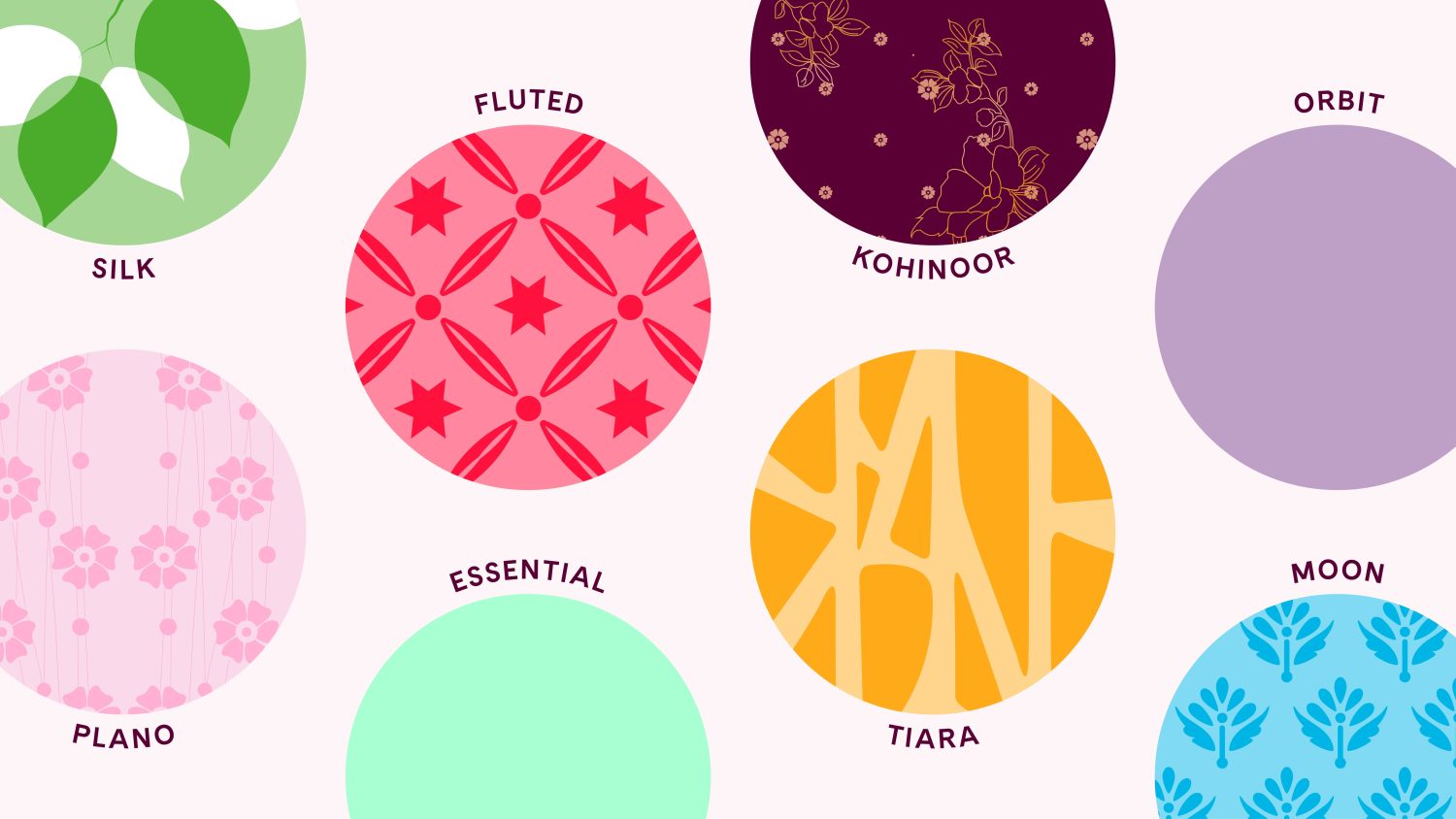
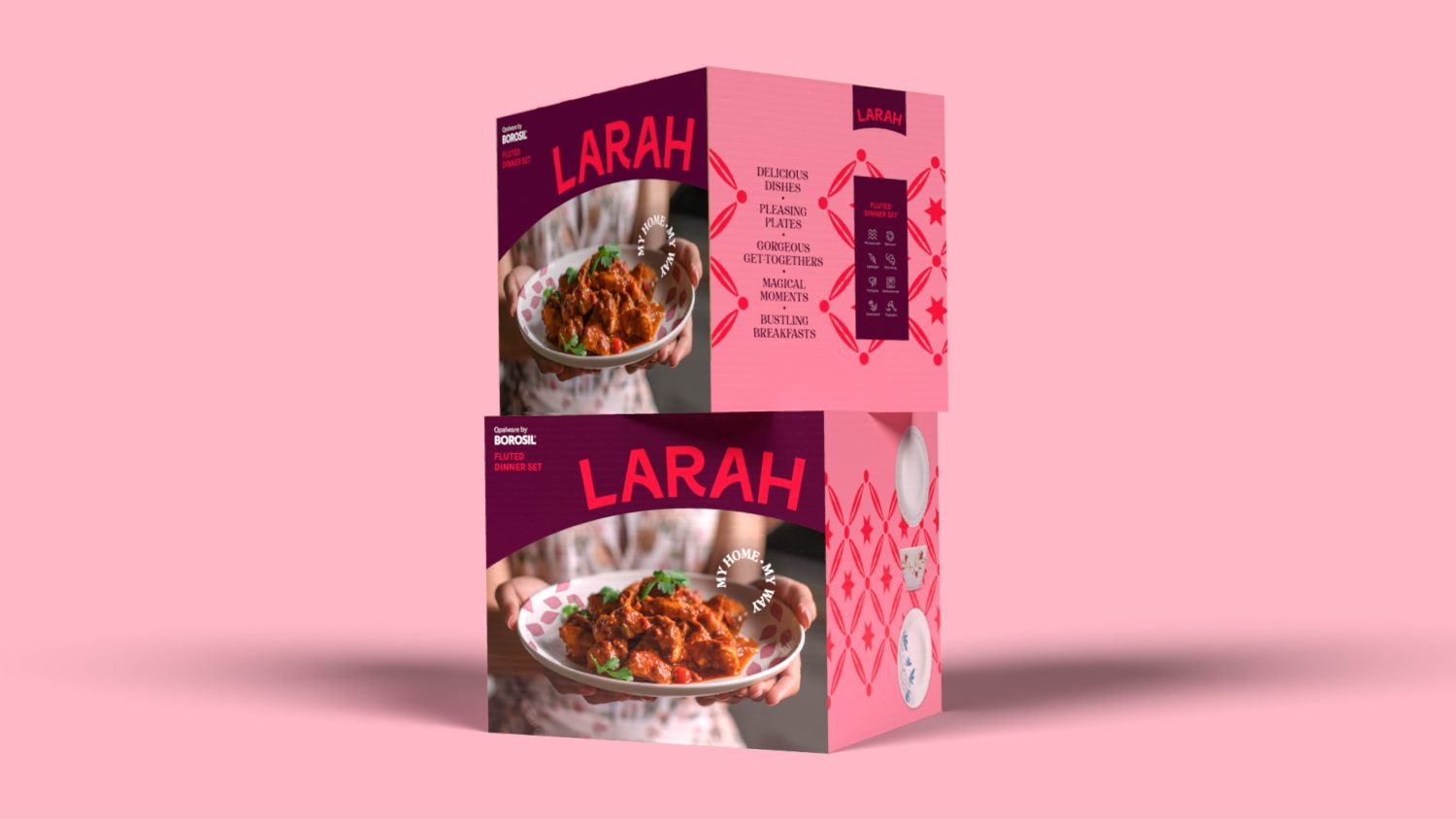
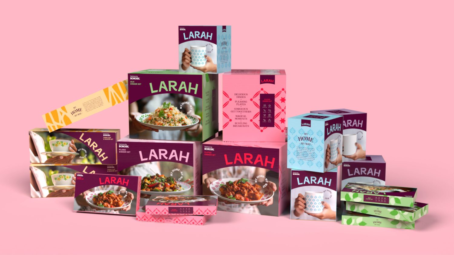
The Indian retail environment is incredibly competitive. In stores, packaging boxes from multiple brands are piled high, with many copying each other using traditional Indian design conventions. Larah needed to stand out with a memorable brand identity, whilst blending modern and traditional Indian sensibilities. Inspired by Larah’s promise to ‘Express your real self’, the identity celebrates Indian homemakers and their personal choices.
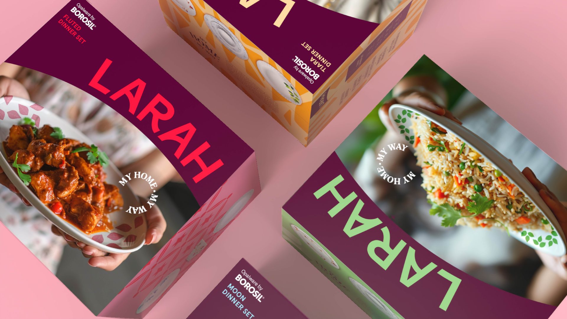
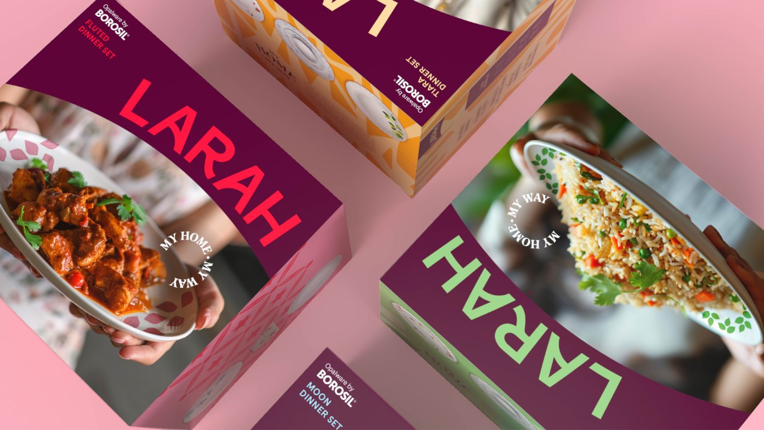
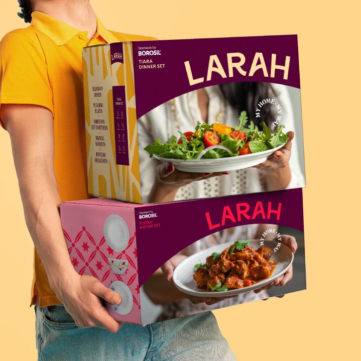
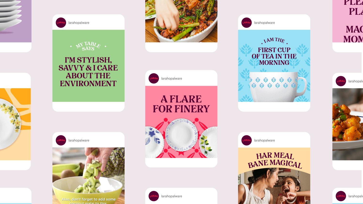
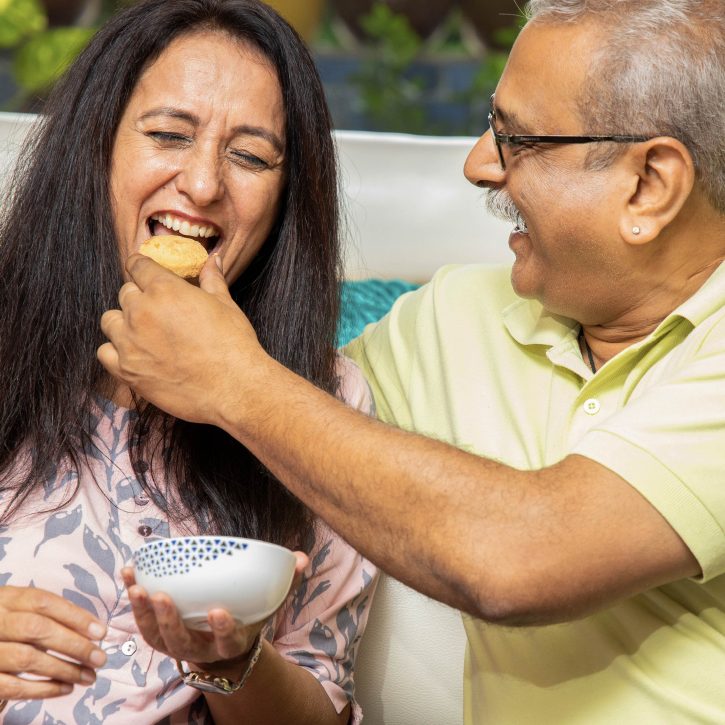
Inspired by Larah’s products, its visual identity is full of curves, colours and patterns. The logo sits distinctively on a curve on packaging so it can clearly be seen on a busy shop shelf. The headline font adds a decorative touch, bringing traditional Indian flair to balance the modern elements. Photography stands out from competitors with a lifestyle focus, embracing the vibrancy and joy of Indian mealtimes.
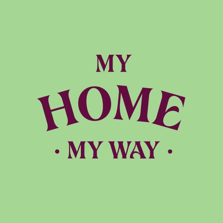
We designed Larah’s tone of voice with its customers and retailers in mind, focusing on memorability, ownability and encouraging self expression. The tagline ‘My home, my way’ speaks proudly in the first person and is a clear call to action, emphasising that ‘home’ is an embodiment of self-expression. The narrative acts as a uniting celebration of Indian homemakers, inspired by the poetry of beautiful moments that homemakers create in their lives.
Although Larah is an English speaking brand, we designed the tone to authentically reflect modern India by seamlessly weaving in other Indian languages. Hinglish (a blended language of Hindi and English) is a true representation of modern India, so we captured Hinglish phrases that expressed Larah’s customers’ real selves, in their words.
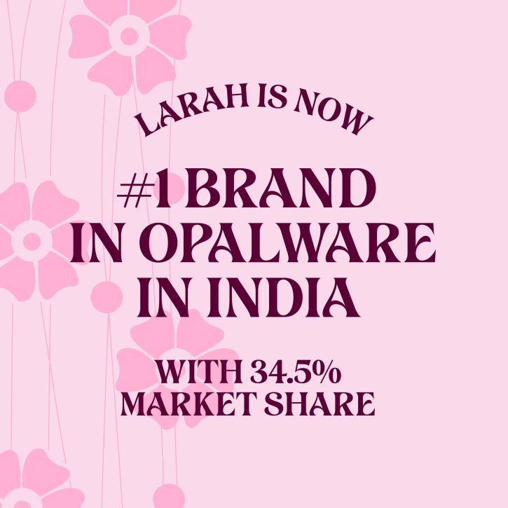
Since the brand refresh, Larah’s market share has dramatically increased to become the no.1 opalware brand in India, and sales are up by 37% year-on-year (2023-2024). Awareness has increased too, with web traffic and Instagram following both increasing 40% year-on-year. Our creative partnership with the Larah team continues to flourish as we support them with this period of growth and expansion.