Positively Languages
Transforming language learning, positively.
Positively Languages
Transforming language learning, positively.

Kaplan is a well-known global educational brand with a great reputation: two decades offering high-quality teaching, 24 year-round language schools, 21 summer camps, and over 40,000 students a year. But as a brand it blended into a sea of sameness. Like many of its competitors Kaplan was relying on the predictable tropes of academia – corporate blues, generic classroom photography, and a formal, functional tone of voice focused on tradition and scale.
We needed to help them create a new brand and name that, most importantly, broke away from the existing Kaplan name and identity, but would also stand out from the conventional look and feel of nearly all language schools. And of course, we had to do all this without losing the underlying trust Kaplan had built over 20 years.
Why do people learn a language? Nobody signs up just to study grammar rules. They learn a language to do something with it. Get a job, go to university, maybe move abroad. Whatever it is, language isn’t the destination, it’s the tool that gets you there.
We wanted to show how learning a language builds confidence and opens up exciting new opportunities. And not just through classroom teaching. Kaplan’s real strength had always been immersion – learning through homestays, social activities, and practical, everyday conversation. We brought these ideas together in a clear brand positioning summarised by the promise: ‘experience that moves you forward’.
We wanted to give the new brand a name that reflected the positioning and idea that when you make real progress with a language, you build lasting confidence. The name is Positively Languages. It shifts language learning from a static classroom subject into an encouraging step toward each student’s personal goals. And it sets the tone for the whole brand – positive, energetic and engaging.
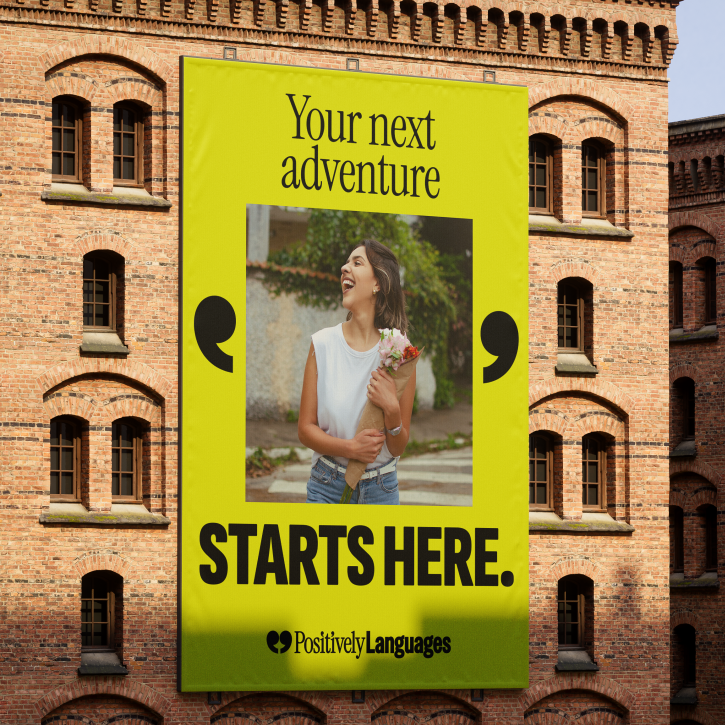

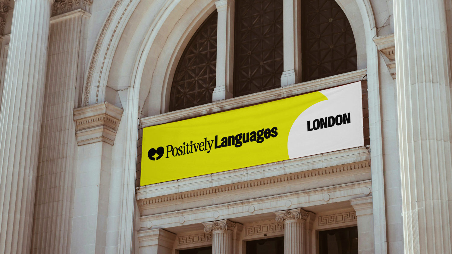
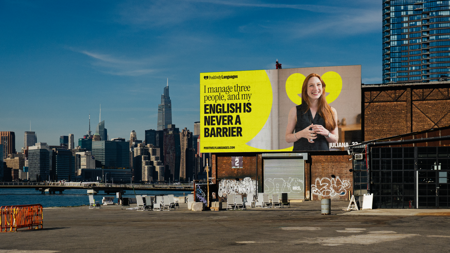
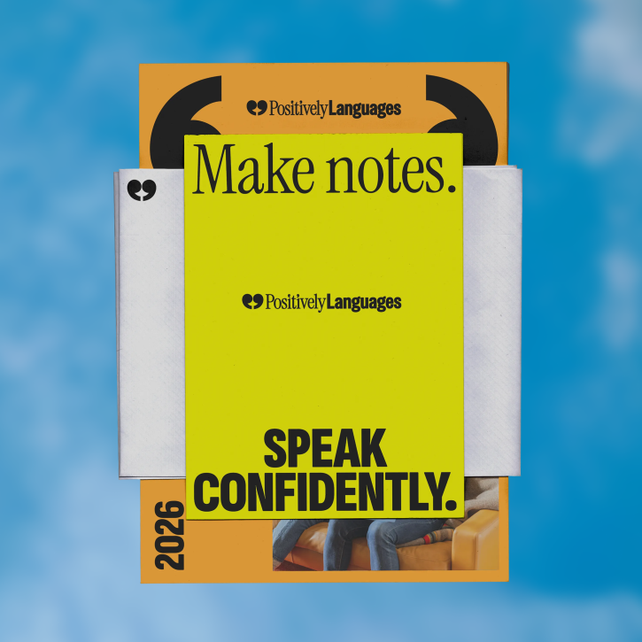
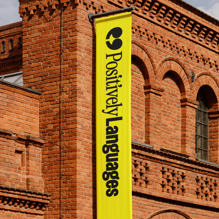
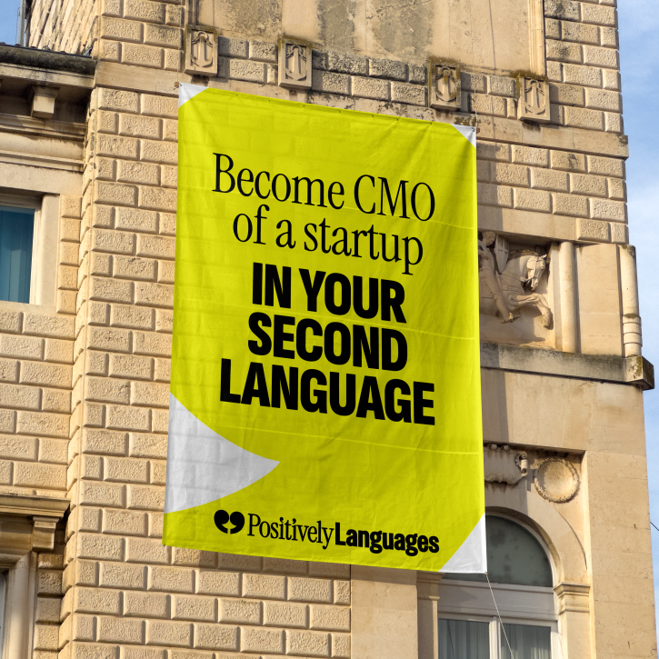
We wanted the new brand to feel vibrant, direct, and modern. We replaced predictable academic blues with an energetic palette of yellow and black, making the brand truly distinct from its competitors.
The logo is a combination of speech marks, a heart and a smile to really reflect the core brand concepts of dialogue and connection. We also turned the speech mark motif into a flexible graphic system that can be used to frame content and spotlight real student experiences. For typography, we paired Instrument Serif – to maintain the sense of educational prestige – with the clean drive and energy of Sofia Sans Extra Condensed.
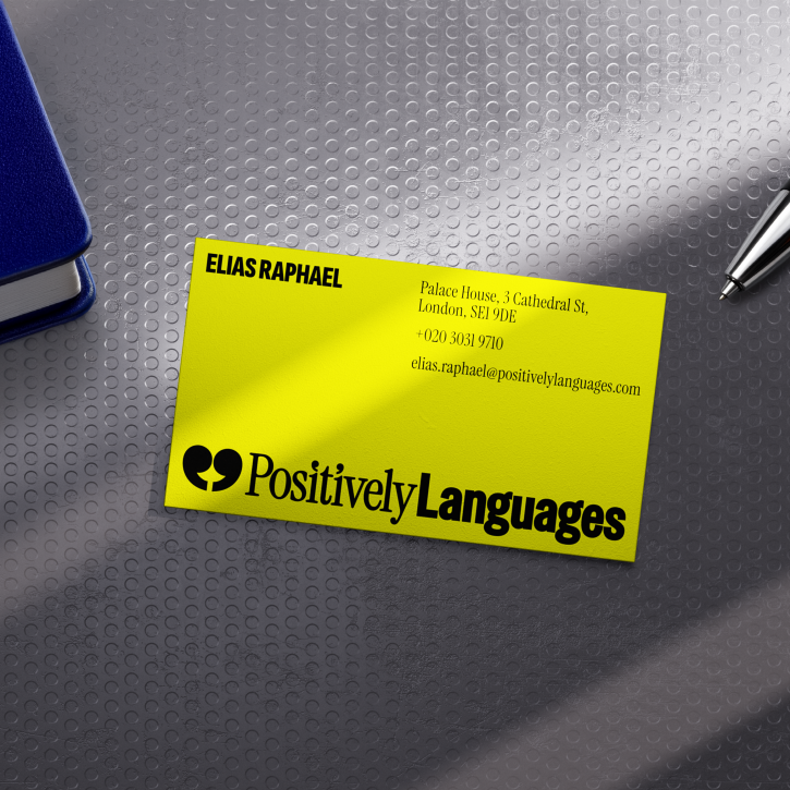
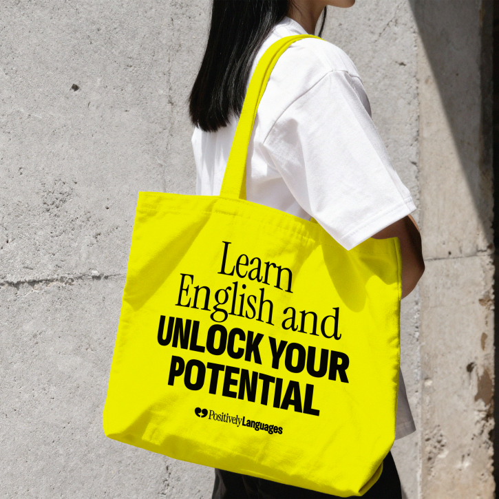
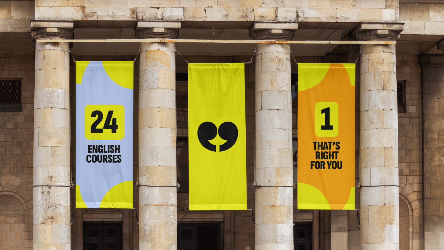
Like every other element of the brand, tone of voice was a huge opportunity to stand out. We stripped out stuffy, academic jargon and formal English to create a tone of voice that focuses on relatable life moments. Highlighting the possibilities that learning a new language can open and always looking forward to reflect our brand promise.
We also kept in mind that a large number of Positively Languages’ audience won’t be native English speakers, so we made sure the tone was underpinned by straightforward and accessible everyday English.
The result is a brand that does so much more than just say ‘learn a language’. It invites students to pursue new exciting experiences, to take advantage of the doors that language learning opens, and ultimately to feel confident using their new skills.