For over a century, SPANA has been dedicated to supporting the working animals that are vital to some of the world’s most vulnerable economies. Theirs was a story of deep expertise and shared knowledge, giving owners and vets the tools to care for their animals. Reducing recurring injuries, treating disease and improving animals’ wellbeing to build resilience in these poor communities.
But after a hundred years the challenges facing working animals were growing. To make a real difference they needed to transform from a niche charity with a small loyal following, to a global NGO with a broader influence.
Heritage had become a barrier
With such a long history, it’s easy to feel that radical change is disingenuous to the past. But following a major strategy review, SPANA knew they needed to transform. The global landscape of climate-crisis, economic volatility and unrest have made the world even more challenging for the communities that rely on their working animals. SPANA needed to engage with more partners in more places to provide the help and support animals and communities need to survive. And their heritage lead brand was holding them back.
The SPANA name, an abstract acronym was a linguistic hurdle. It forced every conversation to start with an explanation. Their identity lacked a sense of urgency and made them look small and parochial. They needed to change their name and a radically evolve their identity to communicate the scale, urgency and impact of their work. They needed to re-position themselves as a serious, global NGO.
Making working animal welfare impossible to overlook
The strategy was built on a simple, moving truth, working animals are the silent, forgotten driving force behind millions of lives around the world. The organisation had to make them impossible to overlook.
The first and biggest step was to let go of the name. After much consultation with their audiences around the world, SPANA was retired and a new descriptive name that required no explanation was introduced – Working Animals International.
The visual and verbal design system
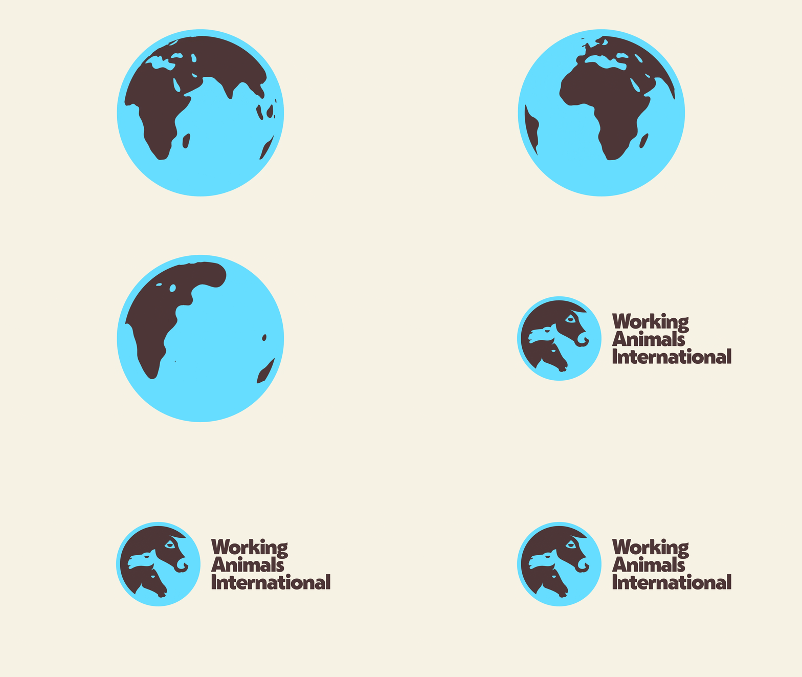
The visual identity system is designed to tell stories. For the new symbol we collaborated with the illustrator Andrew Nye to create a globe containing the beautifully entwined heads of a donkey, camel and horse. It’s a symbol of protection and reach, putting working animals at the centre of their world. It’s bold, modern and designed to be understood by anyone, anywhere, regardless of the language they speak or their level of literacy.
Colours drew inspiration from the landscape and natural environment. From the dark earth working animals tread, to the deep oranges of a desert sunset and the muted sands and blues of their sky.
Imagery makes sure working animals are always seen – putting them first in every picture. By lowering the camera to their eye-level, they are not subjects of pity being looked down upon, they’re shown as noble and essential, supported by the communities that depend on them.
A graphic pattern made of hoof prints is practical from a design point of view, conveying energy and a sense of direction, but it also represents the endless, repetitive journeys made by working animals.
The new tone of voice is built from their values – resolute – not afraid to share bold statements or a point of view. Illuminating, shining a light on what matters with stories full of positivity and conviction. Transformative, showing how their work impacts the lives of working animals and the communities around them.
By de-colonialised language and putting animals at the centre of every story we will build recognition, raise awareness, deepen engagement with existing supporters and partners – and open the door to new audiences inspired to make a difference.
The results
A clear and motivating narrative builds on their past but positions them as a global NGO built to face the considerable challenges in some of the poorest communities of the world.
A new name that requires no explanation.
A bold, energetic and dynamic new identity that shares some DNA with the past, but radically transforms the organisation to face the considerable challenges communities relying on their working animals face.
“
From the outset, The Clearing felt like a true extension of our team. They invested significant time in getting to know our organisation, our mission and values, and the diverse stakeholders we needed to engage throughout the process. That insight-led approach meant the new brand was grounded in evidence and deeply rooted in who we are.
The team combined strategic thinking with outstanding creativity, and they were collaborative, responsive and a genuine pleasure to work with throughout. They were also confident enough to challenge us constructively when needed, helping us make bold decisions and ensuring the project maintained momentum at every stage.
The result is a brand that articulates our mission with far greater clarity and shines a light on the often-overlooked issue of working animal welfare. It feels bolder, more modern and better reflects the scale of our ambition as an organisation.
The response has exceeded our expectations. Internally, the new brand has generated real excitement and momentum. Externally, it has been very positively received by donors, partners and peers across the sector, with strong media coverage and encouraging feedback from our international programmes.
We’re delighted with the outcome and grateful to The Clearing for the creativity, insight and hard work they brought to every stage of the process. The new brand gives us a stronger platform to raise awareness of our mission and continue building Working Animals International’s voice for working animals around the world.
Linda Edwards, CEO Working Animals International