
From big, category-redefining concepts to simple, poignant ones, the best brands are built on ideas. And they leverage the meaning at the core of those ideas to build brand equity with every piece of their identity. Whether it’s an iconic colour, message or mark, graphic devices pack more of a punch when they’re made with meaning. Here are five of our favourites.
i-D magazine’s winking models
They’re quirky, they’re fun, and they stand out amongst racks and racks of stone-faced covershots. i-D magazine has always featured winking models on its cover in a photographic echo of their logo. Founder (and ex-Vogue art director) Terry Jones explains the emoticon in their mark as “a hidden eye, because it was about going inside, beyond the surface.” Makes perfect sense for a punk-born publication that’s made its name pushing boundaries and celebrating individuality.
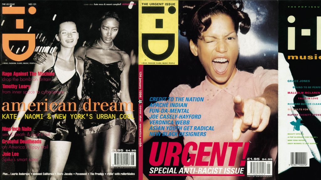
Image: Google Arts & Culture
LSO’s gestural type
How do you capture the energy of a conductor’s movements in a typeface? Motion capture is a pretty good place to start. The Partners (now Design Bridge and Partners), the agency behind London Symphony Orchestra’s conductor-inspired logo, recorded Sir Simon Rattle’s gestures during a rehearsal at the Barbican. Footage from the hour-long session became the inspiration for the typeface, with real lines of movement translated into typographic designs.
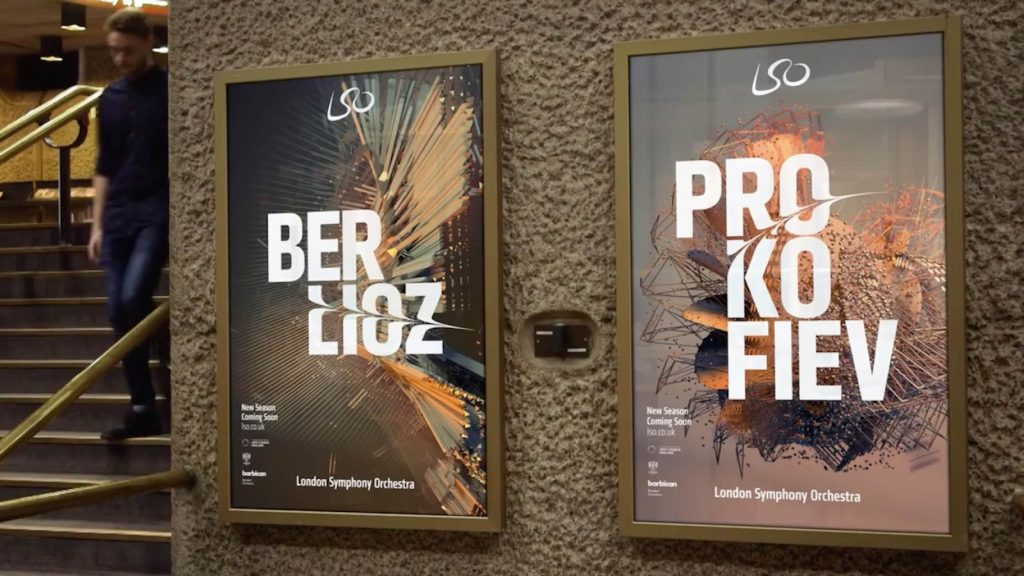
Image: Creative Lives in Progress
Ueshima’s calligraphic illustrations
Creators of the world’s first ready-to-drink coffee, Ueshima have been infusing their craft with Takumi – the pursuit of perfection without compromise – for over four hundred years. We commissioned Japanese calligraphy artist KASHUŪ to create a suite of illustrations for every Ueshima blend. Each of the Shodo-inspired illustrations embodies Ueshima’s rich history of coffee craft, and their meticulous yet artisanal pursuit of perfection.
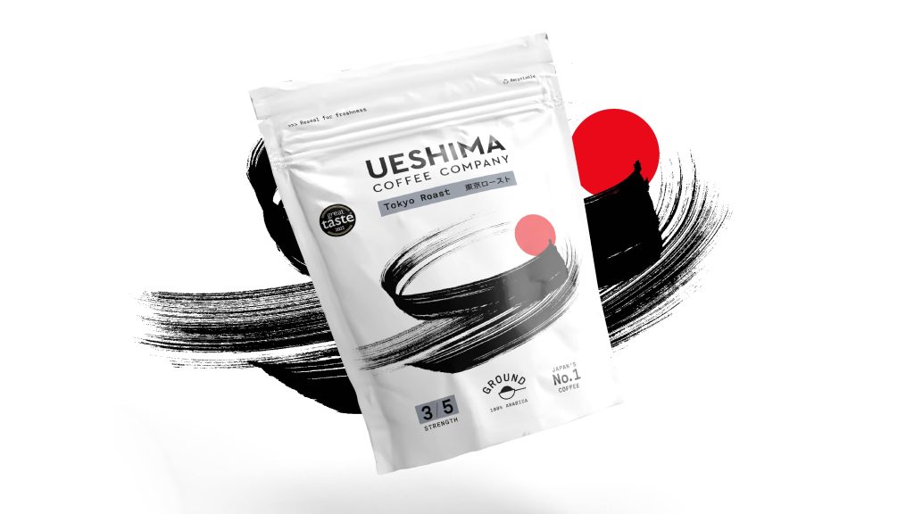
Image: The Clearing
The freshly-baked Leibniz logo
Rooted in the original, the Leibniz logo features all 52 “teeth” of the actual biscuit. It’s also got a sweet new typeface (Butterkeks Display) that evokes the swelling of dough with subtle inktraps. Auge Design say they baked the logo the same way Leibniz bake their biscuits; we say the end result is nothing short of delicious.
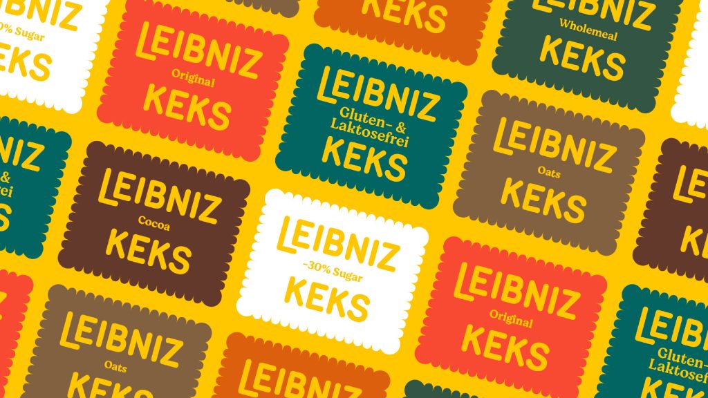
Image: Auge Design
The O2 bubbles
The O2 brand was a breath of fresh air at a time when consumers were overwhelmed with choice and couldn’t readily discern the benefits of competing carriers. Born of the insight that mobile phones are “essential to life,” the bubble device (and the brand name) has been around for well over two decades and is a beautifully simple part of one of the most widely-recognised brands in the UK. London-based motion wizards Fakery set the O2 logo bubbling with a series of different emotive behaviours for everything from TV to social.
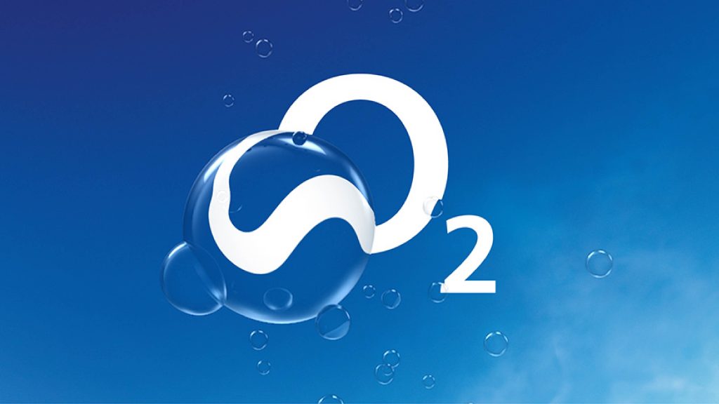
Image: Fakery